
Preface
Prerequisites:
- Introduction to the JSim GUI (required)
- Using Loops in JSim (required)
- Data Files & Project Data Sets (recommended)
Contents:
- Overview
- Terminology
- XY Plot Configuration
- Contour Plot Configuration
- Some Niceties
- Bugs and Limitations
- Notes
- Comments or Questions?
Overview
Nested plots are a feature of JSim 2.07 and above for enhanced visualization of multi-dimensional data. Nested plots are based on Bosan and Harris's "Worlds Within Worlds" graphics (Note 1). A more limited version of nested plots was available in XSIM under the name "Behavioural Analysis".
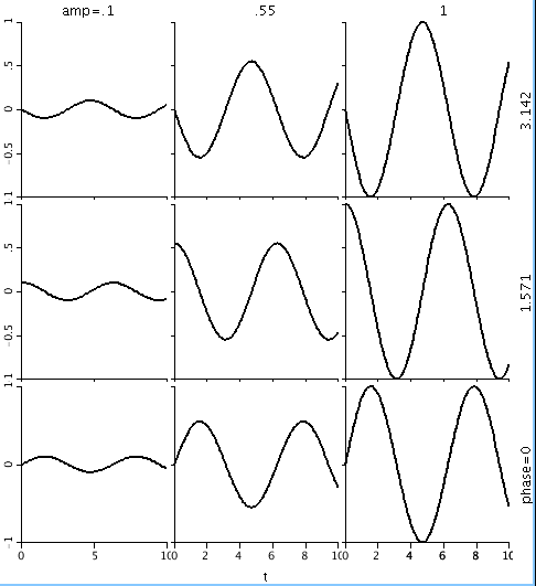
A nested plot is, most typically, a rectangular array of plots where each row and column represent a specific paramter value. In the example below, Each row represents a value of the parameter "phase" and each column represents a value of the parameter "amp". Within each plot the X axis represents the parameter "t", while the Y axis represents the dependent variable u(t,amp,phase). Thus this example allows visualization of 3 independent variables: t, amp and phase.
Terminology
The user configures a nested plot by selecting the data to be plotted and then mapping data domains onto rendering axes. Data to be plotted may model variables or algebraic expressions or data set curves. The data domains of a model variable or expression its realDomains. Model data becomes available for plotting once the model has been run. If model loops are run, "inner loop" and/or "outer loop" are added to the data domains, depending upon the loop configuration. When the data to be plotted is drawn from a data set curve, the data domains are the grids of the curve.
Rendering axes are of four types: inner spatial axes, outer spatial axes, attribute axes and slider axes.
Inner spatial axes (X1, Y1, Z) are the X and Y axes of a single plot. When the plot style is "XY plot", X1 independent and Y1 is dependent. When the plot style is "contour", the X1 and Y1 are independent and Z is dependent.
Outer spatial axes (X2, Y2) refer the the column and rows of individual plots respectively.
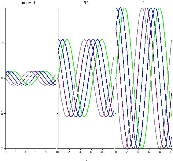
Attribute axes (LINE, COLOR, SIZE, SHAPE, THICKNESS) refer use of curve rendering characteristics to show variation. The example below renders the same data as the first example, but with the data domain "phase" assigned to the COLOR axis instead of the Y2 axis. Each color of curve represents a different value of phase.
Slider axes are user-controllable sliders that select a particular value from a data domain for rendering. When the slider is moved (via mouse or keystroke) the nested plot is redrawn using the new data domain value. This enables data visualization via animation.
Basic XY Plot Configuration
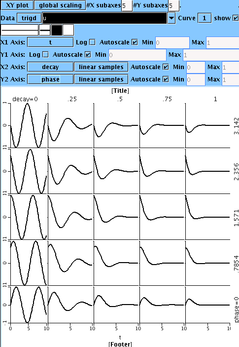
I'll use the model below to show how to configure nested plots. The model contains 3 realDomain: t, decay and phase. These realDomains, plus the parameter "offset" control output curves u and v, which are sine and cosine curves with exponential decay.
Download the project and run it within JSim (version 2.07 or above) on your own system. Create a new nested plot by selecting "New nested plot" from the "Project" tab "Add" menu. On the line labeled "Data", click on the down arrow beside the white text field and select "u". Alternatively, just type "u" into the text field. The text field should blacked, indicating that "u" is a valid variable within model "trigd".
Note that the graphics are shows "No data available". This is because the model has not yet been run. Run the model and the data display will update. You may be initially disappointed with the resulting graph, which shows a constant value u=0. This is because we have not yet assigned u's data domains to any rendering axes. When a data domain is so unassigned, a slider axis is created for the domain. You should see three such sliders, for the realDomains t, decay and phase.
We'll start assign domains to axes with the X1 axis. Note the "X1 Axis" line currently shows "no variation". Click on "no variation" to show possible domains to assign to the X1 axis, and select "t". Domain t is now assigned to the X1 axis, and the graphics should show a sinusoid. The slider for domain "t" has now disappeared, although the sliders for domains "decay" and "phase" remain. Try moving the "decay" and "phase" sliders and note the resulting change in the graph.
Now we'll configure the X2 and Y2 axes to show the variation of "decay" and "phase" within a single image. From the "Nesting" menu, select "enable X-axis nesting". A new line "X2 Axis" will appear in the configurator with the domain selector set to "no variation". At the same time, the graphics will now show a horizonal array of 5 identical graphs. You may change the number of graphs with the "#X subaxes" control at the top the of page, but lets leave it at 5 for now. Click on the X2 Axis domain selector and change it from "no variation" to "decay". The graphics will update to show 5 different values of "decay". Note also that the "decay" slider has disappeared.
Configuring the Y2 axis, is similar to configuring X2. From the "Nesting" menu, select "enable Y-axis nesting". A new line "Y2 Axis" will appear in the configurator with the domain selector set to "no variation". At the same time, the graphics area now shows a 5x5 array of plots. The X2 axis shows variation in domain "decay", but the Y2 axis shows no variation. Click on the Y2 Axis domain selector and change it from "no variation" to "phase". The graphics will update showing "decay" variation horizontally and "phase" variation vertically. At the same time, the "phase" slider will disappear. Note that if you make the mistake of assigning the same data domain to more than one axis, an error message is generated in the graphic display that will remain until the duplication is removed. Your graphic display should now look similar to the following:
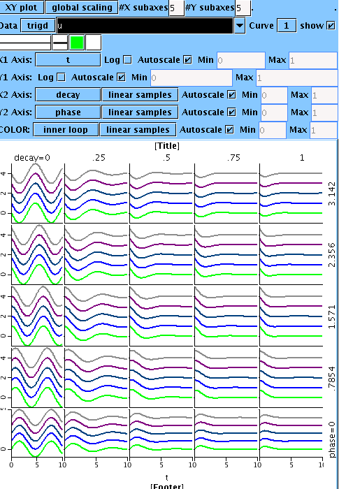
The "Loops" tab of the example project is configured so that the "inner loop" varies model parameter "offset". Run model loops now. The nested plot graphic display looks very similar to before (although it has a different scale) and a new slider appears with the name "trigd: inner loop". Moving this slider will show how the parameter "offset" affects model output. From the "Nesting" menu select "Enable color variation". A new line labeled "COLOR" will appear in the configurator with its domain selector set to "no variation". Change the domain selector to "inner loop". The resulting display will use color variation to show how model output varies with parameter "offset". Some sets of colors may be more pleasing to the eye than others. You may vary which colors are used by altering the square color control located under the "Data" line text box. The final result should look similar the following:
Instead of using "COLOR" variation, you may wish to experiment with other attribute variation. To do this, disable color variation in the "Nesting" menu, enable another type of variation, and proceed similarly.
Contour Plot Configuration
Configuring nested plots using contours is largely similar to that using XY plots. We'll use the same project as a starting point:
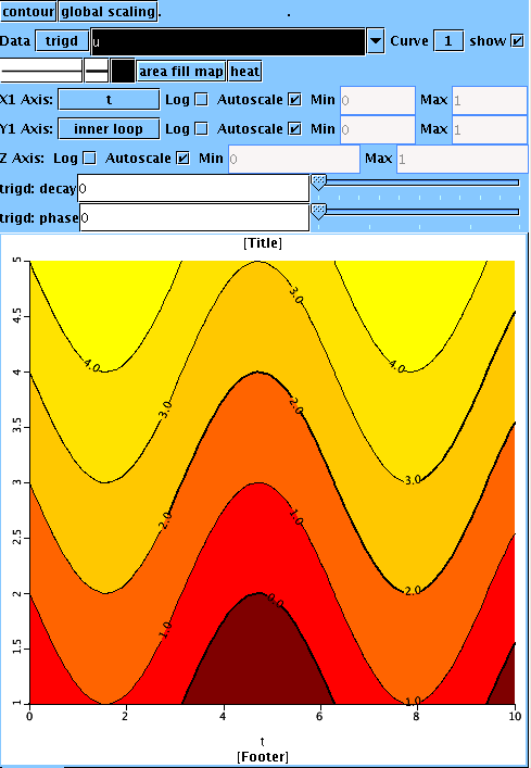
Run JSim using the downloaded project file. Run model loops, then create a new nested plot tab as before. Click on "XY plot" in the upper left of the nested plot configurator and change it to "contour". Notice there are now 3 axes: X1 and Y1 for data domains and Z for the dependent variable. Enter "u" in the "Data" line selection box. It should blacken, and an empty contour plot will appear in the graphics area. Set the "X1 Axis" variation control to "t" and the "Y1 Axis" variation control to "inner loop". Wavy line contours should appear in the graphics area. Change the colormap control on line 3 of the configuration area from "no colormap" to "area fill map". The contours should now be filled will colors from the "heat" color scale, resembling the following:
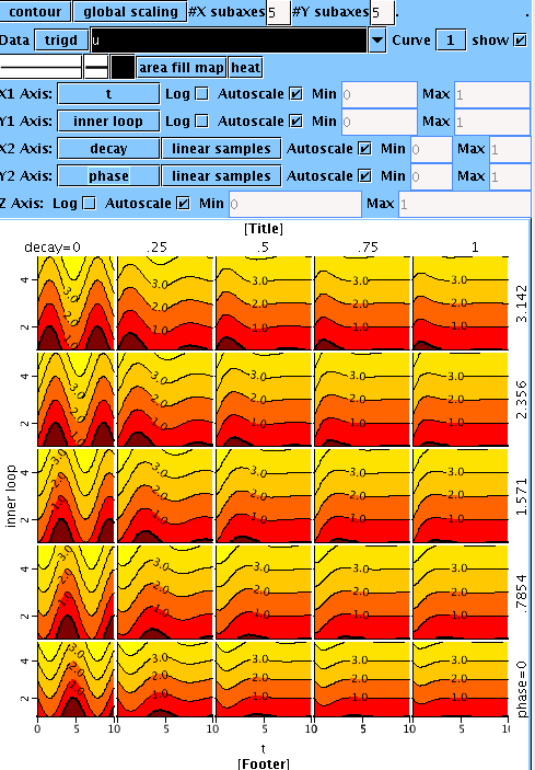
Now, as in the XY plot example, enable X and Y nesting from the "Nesting" menu and set the X2 axis variation to "decay" and the Y2 axis variation to "phase". Voila!
Some Niceties
A default "Title" and "Footer" appear is your plot for labeling purposes. Click on either one to edit the text. If you'd rather use that space for graphics, toggle the "Show title" and/or "Show footer" items from the "View" menu. The "View" menu also allows you to hide the entire configurator to maximize the graphics area once configuration is complete.
When either X or Y nesting is activated, clicking on a single plot zooms the display into that single plot for closer examination. Clicking on the zoomed plot, reverts JSim to the normal nested display.
A text representation of the data in a nested plot is available for display and export via the "Text" tab and the bottom of a nested plot.
All axes offer autoscale or manual scale options. When autoscale is off, manual scale bounds become active and are editable.
X1 and Y1 axes offer optional log scaling.
Outer spatial axis (X2, Y2) and attribute axes (e.g. COLOR) offer a choice of sampling methods: "linear samples", "log samples" and "list samples". The first two methods pick a number of samples between the specified data min and max. "list samples" allows the user to enter a comma separated list of the sample values desired. The list must be in strictly ascending numerical order.
The variable scaling control on top line of the configurator has three possible values. It applies to the scaling of the dependent variable and inner spatial axis ranges when autoscale is on. The default "global scaling" is usually appropriate, however the other options are sometimes useful:
- global scaling: autoscale to the range of the entire data set under study, including all possible slider values. This will not rescale when sliders are moved, allowing animation to be meaningful.
- page scaling: autoscale to the range of all visible data curves. This will rescale when sliders are moved to present the most robust view for the present slider values.
- local scaling: autoscale each individual plot separately. This can be useful when different plots have vastly different scales.
Bugs and Limitations
The following bugs and limitations are recognized by the developers and will be addressed as time allows:
- The graphics are a little flakey. Sometimes clicking on another right-side tab and then returning to the nested plot tab is necessary to clean up the display.
- Axis tic marks and numeric labels are substandard.
- Graphics are displayed after each model run terminates. The is currently no "update during run" option like there is in standard plot pages.
- Plotting one variable on the X axis against another on the Y axis, as in a phase plot, is not yet supported.
- Labeling of multiple plot curves is absent in nested displays and suboptimal in zoomed displays.
- Encapsulated Postscript export is not yet available as it is in standard plot pages.
Notes
Bosan, Sorel and Harris, Thomas R.. A Visualization-Based Analysis Method for Multiparameter Models of Capillary Tissue-Exchange. Annals of Biomedical Engineering, Vol. 24, pp.124-138, 1996.
Comments or Questions?
Model development and archiving support at https://www.imagwiki.nibib.nih.gov/physiome provided by the following grants: NIH U01HL122199 Analyzing the Cardiac Power Grid, 09/15/2015 - 05/31/2020, NIH/NIBIB BE08407 Software Integration, JSim and SBW 6/1/09-5/31/13; NIH/NHLBI T15 HL88516-01 Modeling for Heart, Lung and Blood: From Cell to Organ, 4/1/07-3/31/11; NSF BES-0506477 Adaptive Multi-Scale Model Simulation, 8/15/05-7/31/08; NIH/NHLBI R01 HL073598 Core 3: 3D Imaging and Computer Modeling of the Respiratory Tract, 9/1/04-8/31/09; as well as prior support from NIH/NCRR P41 RR01243 Simulation Resource in Circulatory Mass Transport and Exchange, 12/1/1980-11/30/01 and NIH/NIBIB R01 EB001973 JSim: A Simulation Analysis Platform, 3/1/02-2/28/07.